Carrying “Joyous Harmony” with You? The Thoughts Behind the Colors of TIGER Bottles
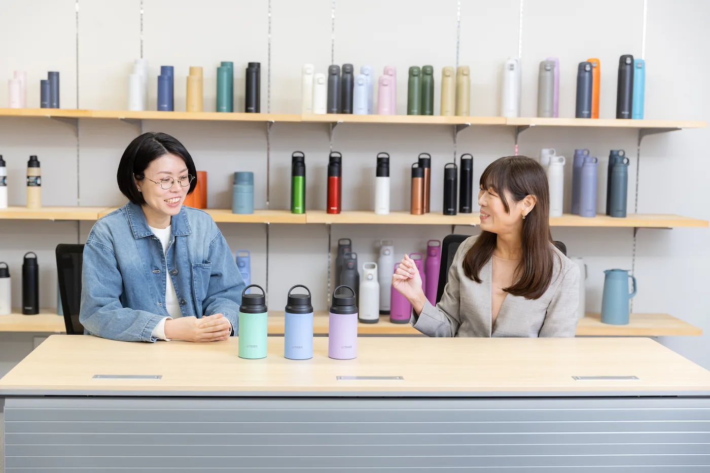
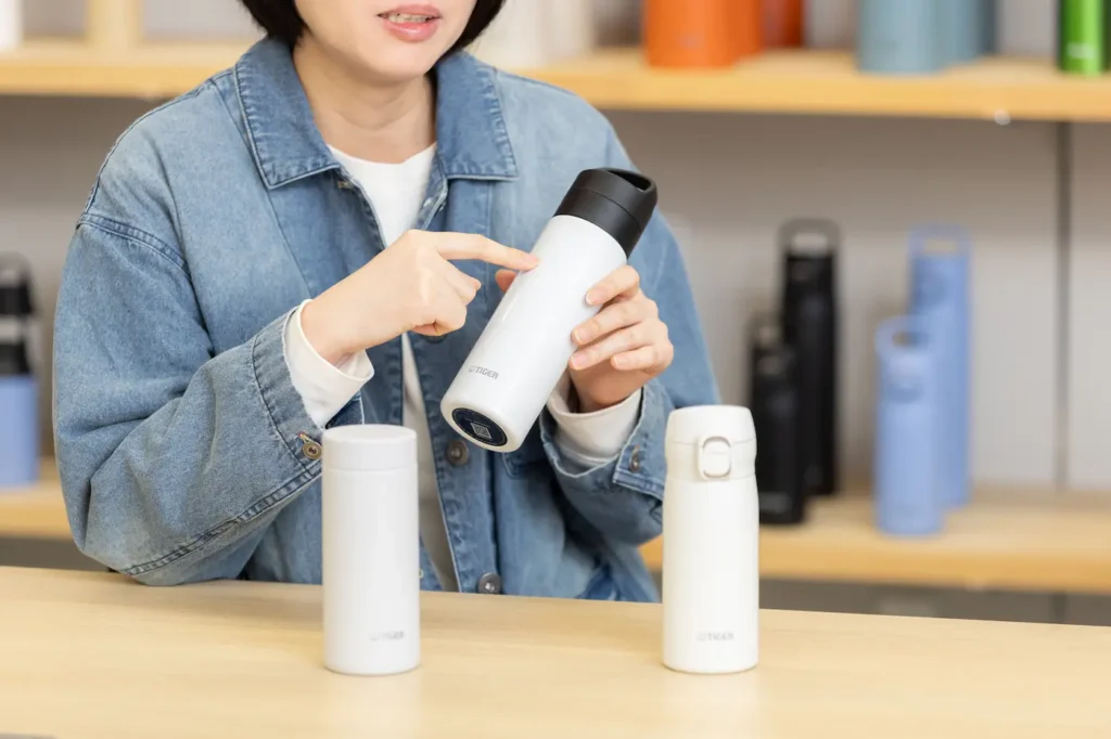
Vacuum insulated bottles are now an indispensable part of our daily lives. Among their features, “color” is one of the essential elements that influence the joy of choosing. At TIGER, we design colors starting from the scenes where our customers use their bottles. This time, we asked Takada from the Product Planning Team and Kitajima from the Design Team about the behind-the-scenes process and the thoughts poured into the colors.
Table of Contents
Colors are not “chosen,” but “emerge” from the scene
In the product planning stage, we set a concept of “when,” “where,” and “how we want it to be used,” and share this with the Design Team. In addition to “who will use it,” we place great importance on “in what kind of scene it will be used” to select the most fitting color.
For example, for compact models designed for carrying around, we choose brighter colors that are easy to find in a bag; for larger sizes intended for office use, we opt for basic colors that blend well with the space. In this way, we make our decisions by taking the usage scenes into account.
The Design Team is divided into product and color departments, and I am in charge of color design. When there is an offer from the Product Planning Team, the product designer first decides the shape, and then we design the color to match the product’s shape and target audience. Combining new products and new colors for existing products, we release about 10 to 20 colors a year.
We are also conscious of trend colors. During the COVID-19 pandemic, my impression was that muted earth tones were popular, but now that behavioral restrictions have been lifted and people’s moods are brightening, highly saturated and bright, pop and colorful bottles are increasingly being chosen.
However, we do not decide based solely on trends. We make our final judgments based on whether the color matches the product’s concept, taking into account the scenes in which it will be used.
Designing the impression given by even the same color, down to its “texture”
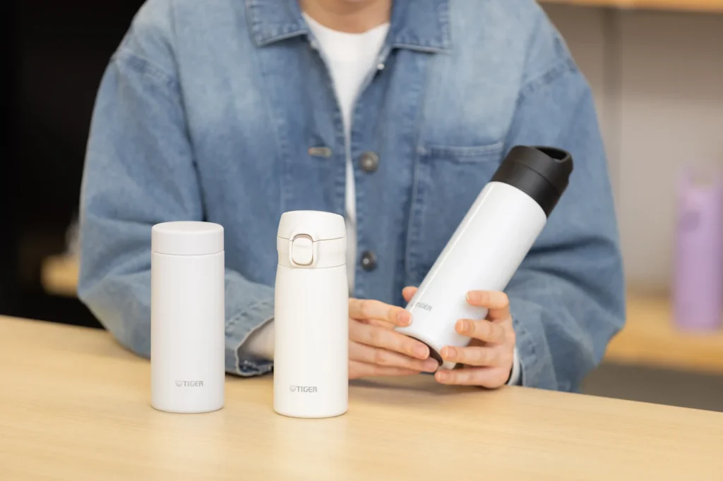
Bottles come in a variety of textures, from those with a glossy surface to those with a rough, matte finish. Currently, matte textures are relatively mainstream, but we use them selectively according to the usage scene and the shape of the bottle.
For example, bottles intended for sports or outdoor scenes use a coarse, bead-like paint with a grippy feel so that they don’t slip when held in the hand. The same applies to screw-type bottles that are opened by twisting the lid. On the other hand, push-button types that can be opened and closed with a button on top do not require grip, so we use clear, smooth paints.
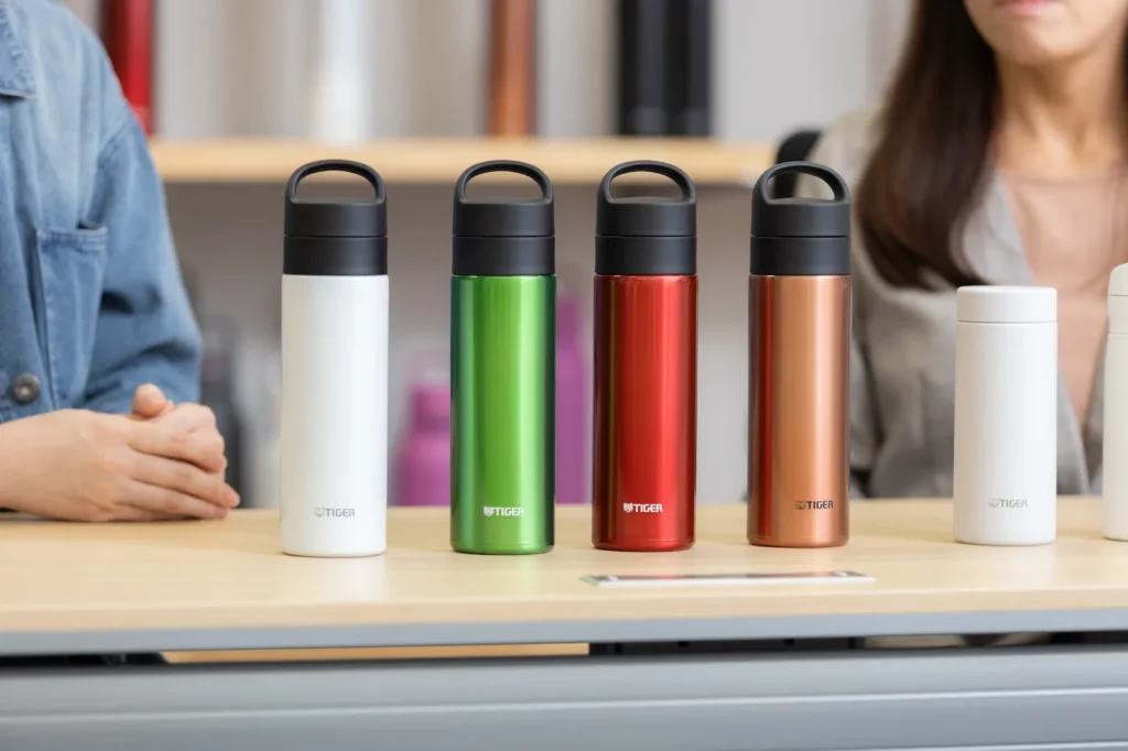
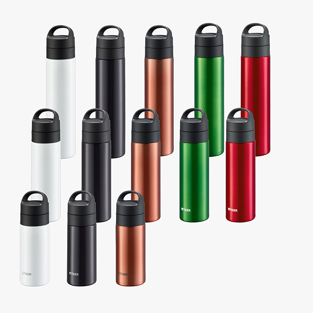
The “MKB-T” series, a carbonated drink-compatible line that revamped its colors in 2025, employs a clear, glossy paint inspired by the designs of commercial carbonated beverage and beer cans.
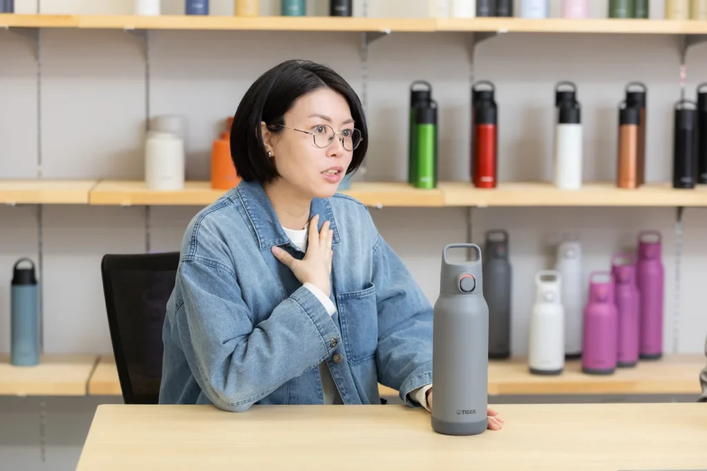
Reproducing color tones that match these textures is actually quite difficult. The reason is that while we create the color samples, the factories that mass-produce them based on these samples are located overseas, such as in Vietnam and China, and the colors look completely different there compared to Japan due to the sunlight. Furthermore, because the actual color tone is not finalized until the paint dries, we cannot give numerical instructions like “add 3% red.” We repeatedly create prototypes to mix colors while meticulously explaining the product concept via email and phone.
Expressing the colors of the “MKB-T” series bottles was particularly challenging. Adopting transparent paints to make the most of the stainless steel texture made it difficult to express saturation and prone to uneven coating. With pearlescent or opaque paints, we can specify colors based on the three axes of “hue,” “lightness,” and “saturation,” but with transparent or pearlescent paints, the number of specification items increases to include elements like “density,” “texture,” and “amount of pearl.” Since increasing the density can sometimes alter the hue, a high level of skill is required for color mixing.
The “shape” of the bottle calls for the color.
The shape of the bottle is also a crucial factor when deciding on a color. The colors that suit a simple screw-type and a push-button type with a button are slightly different. Since many of TIGER’s bottles feature a stylish design, we constantly consider colors that “do not interfere with the shape.”
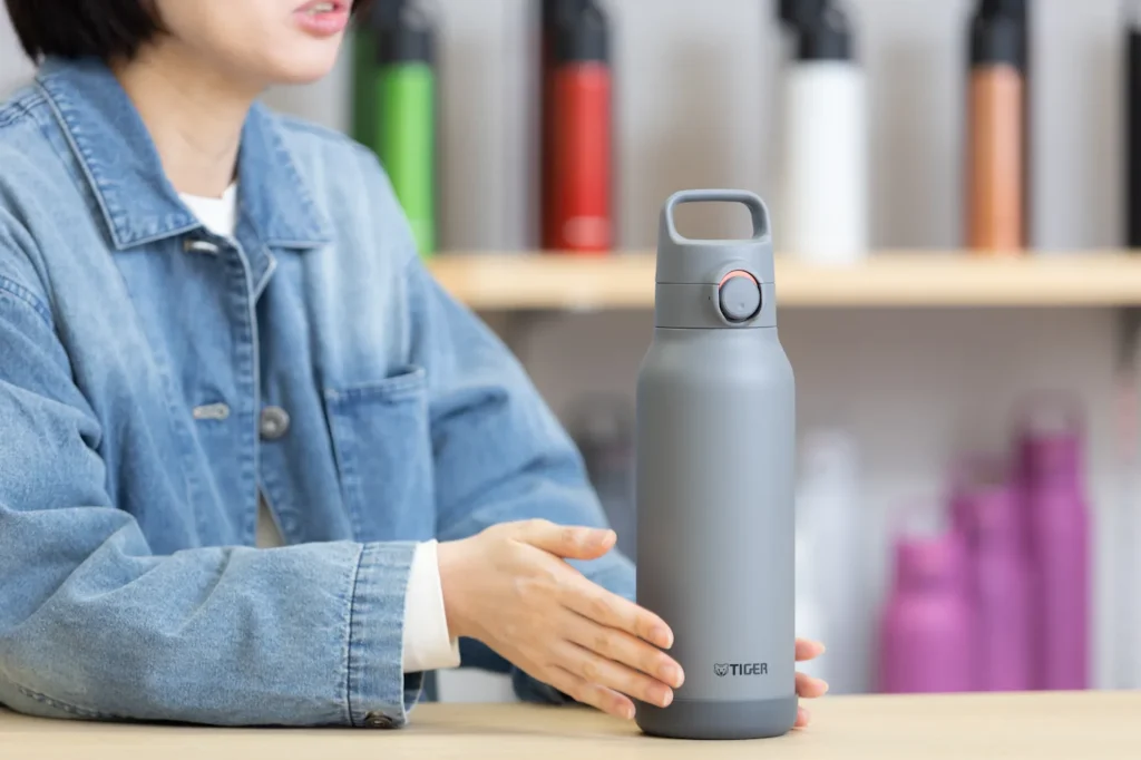
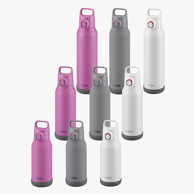
For instance, the push-button type “MTA-H” series, which allows for quick hydration even during sports, has a darker gray cap and bottom, so we use orange as an accent color for the button area. Inspired by the designs of running shoes and sportswear, we incorporated highly visible colors that act as a striking accent.
To meet various needs, we propose about 10 patterns in the initial stage. We sometimes experiment with impactful color schemes, but if they don’t match the shape, it inevitably creates a sense of incongruity.
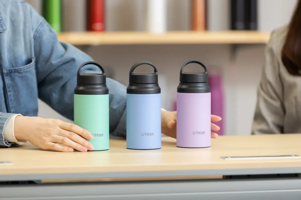
For example, applying a pastel color to a large product makes it look bloated, but it matches perfectly when used on a compact product. Personally, I have been wanting to release brown-toned products, though it hasn’t quite reached commercialization yet, so I hope to realize it in some form someday.
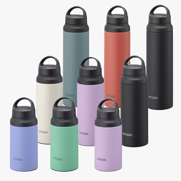
For the outdoor-oriented “MCZ-G” series, the area from the handle to the cap is unified in black, so we intentionally apply bright colors to the main body to create contrast. We established themes related to the global environment for the color names, such as “protecting beautiful sandy beaches,” “soil pollution countermeasures,” and “endangered species protection,” to give them a natural affinity with outdoor scenes.
Furthermore, we heavily value the perspective of creating colors that bring out a “TIGER-ness” not found in other companies. For example, for the “MKL-W” vacuum insulated food jar, we added a bold color pattern called “Vermilion,” which adopts a terracotta-style orange, to our variations. We chose this from the perspective of colors that make food look appetizing, referencing tableware and table coordination. We are often told that having a decidedly vibrant color among the options is very characteristic of TIGER.
Color variations born from customer voices
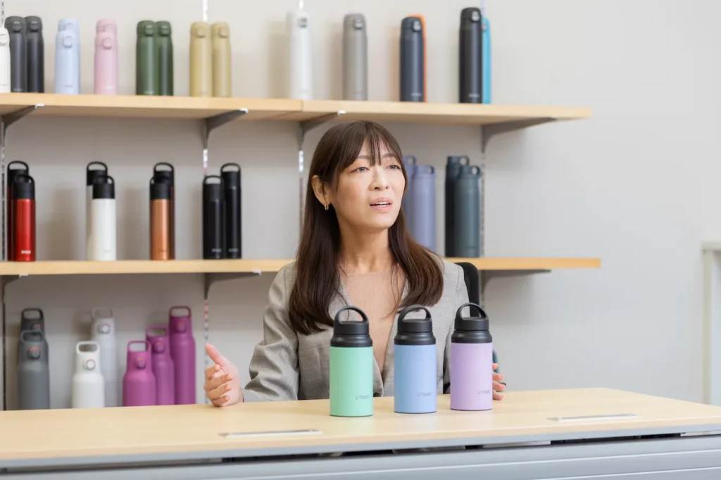
Precisely because bottles are something people carry around constantly, I believe they reflect the customer’s personal tastes. Therefore, we rely heavily on our customers’ voices.
For example, customer surveys revealed that our compact 0.2L bottles are often carried by elderly customers during walks or used for taking medication. Thus, we have sometimes adopted bright yellows or vivid blues so that they are easy to find in a bag. While we receive positive feedback saying, “It lifts my mood,” we also get opinions stating, “It’s a bit too flashy,” so we currently offer more subdued colors as well. We feel the daily challenge of trying to achieve a perfect score.
Recently, even when it comes to a single color like white, there seems to be a tendency to prefer nuanced shades, such as a slightly grayish white or a white closer to beige. Customer preferences are also evolving in line with trends, so we try to catch up with them each time. In the past, we updated the colors of existing products about once a year, but because trends are shifting so rapidly now, we aim to reflect requests as quickly as possible.
The daily life supported by bottles, and the “Joyous Harmony” beyond it
What we are most mindful of in order to realize the “joyous harmony” our company strives for is, ultimately, how closely we can stay aligned with our customers. Our primary consideration revolves around the perspective of, “If it’s going to be used by this kind of person, in this kind of scene, in this way, wouldn’t this be the absolute best color?” When customers who pick up our products write in surveys, “Just holding it lifts my spirits,” or “I chose this because I didn’t have this color yet,” we truly feel the power of color, and it makes us incredibly happy.
We also recommend that customers collect bottles in different sizes and colors so they can choose according to their mood or belongings that day, such as, “My bag is small today, so I’ll go with a compact bottle,” or “I’ll be out all day, so I’ll bring a larger one.” We hope people will reach for them as joyfully as they would choose their daily outfits.
We are also conscious of design planning that adapts to the changing times. For example, in the past, the mainstream for children’s water bottles was those featuring characters or illustrations and equipped with a strap, wasn’t it? However, today, an increasing number of elementary school students are selecting stylish designs that even adults could use, and we are introducing color variations that reflect such changes. Furthermore, perhaps because it has become a modern habit to carry extra hydration to prevent heatstroke, larger sizes are increasingly being chosen even for children.
When choosing a new bottle, we would definitely love for you to hold the actual product in your hands and physically experience its “lightness” and “ease of use.” Precisely because it is something you carry around every single day, even the slightest extra weight can become stressful, and you may gradually stop using it. We would be delighted if you could choose a bottle that you can cherish for a long time, perfectly balancing it with your own lifestyle and personal belongings.

Profile
Aiko Takada / Aiko Takada
Product Planning Team, Vacuum Flask Group Planning, TIGER Corporation

Profile
Akiko Kitajima / Akiko Kitajima
Design Team, Solution Group, TIGER Corporation
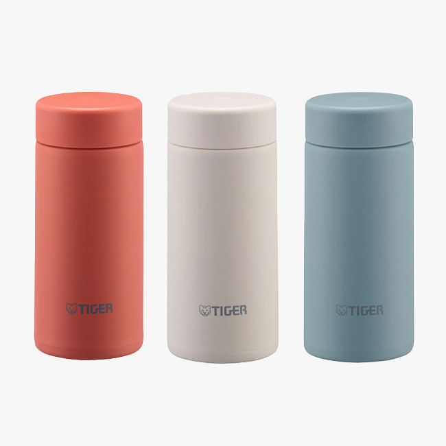
Vacuum Insulated Bottles
Vacuum Insulated Carbonated Bottle MKB-T361/T481/T601
Hot, cold, and carbonated drinks are all OK! A slim type vacuum insulated carbonated drink bottle.
Vacuum Insulated Bottles
Vacuum Insulated Bottle MCZ-G040/G060/G080
Stopper with an integrated gasket Active Model with Handle
Vacuum Insulated Bottles
Vacuum Insulated Bottle MTA-H100/H120/H150
Large-capacity bottle for cold beverages with easy-to-clean cap
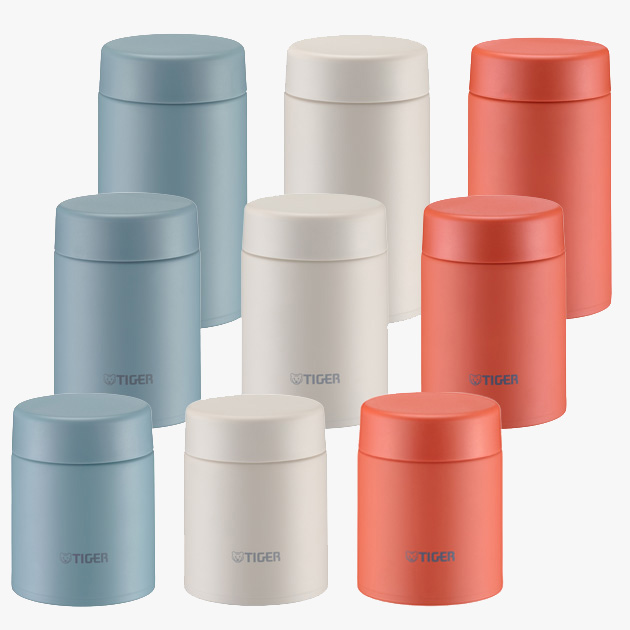
Food Jars
Vacuum Insulated Food Jars MKL-W040/W050/W075
From soup to side dishes and desserts, Available in three sizes.
Limited Edition
Vacuum Insulated Bottle MMP-C020
Easy to clean with Stopper with the integrated gasket and dishwasher-safe feature